Empathy Mapping Isn’t Just for Researchers
Empathy mapping gets written off as an academic exercise, but I’ve found it works in everyday creative work. It forces us to stop designing for ourselves and start designing for the people we’re trying to reach. The tool is simple, which is why it’s powerful.
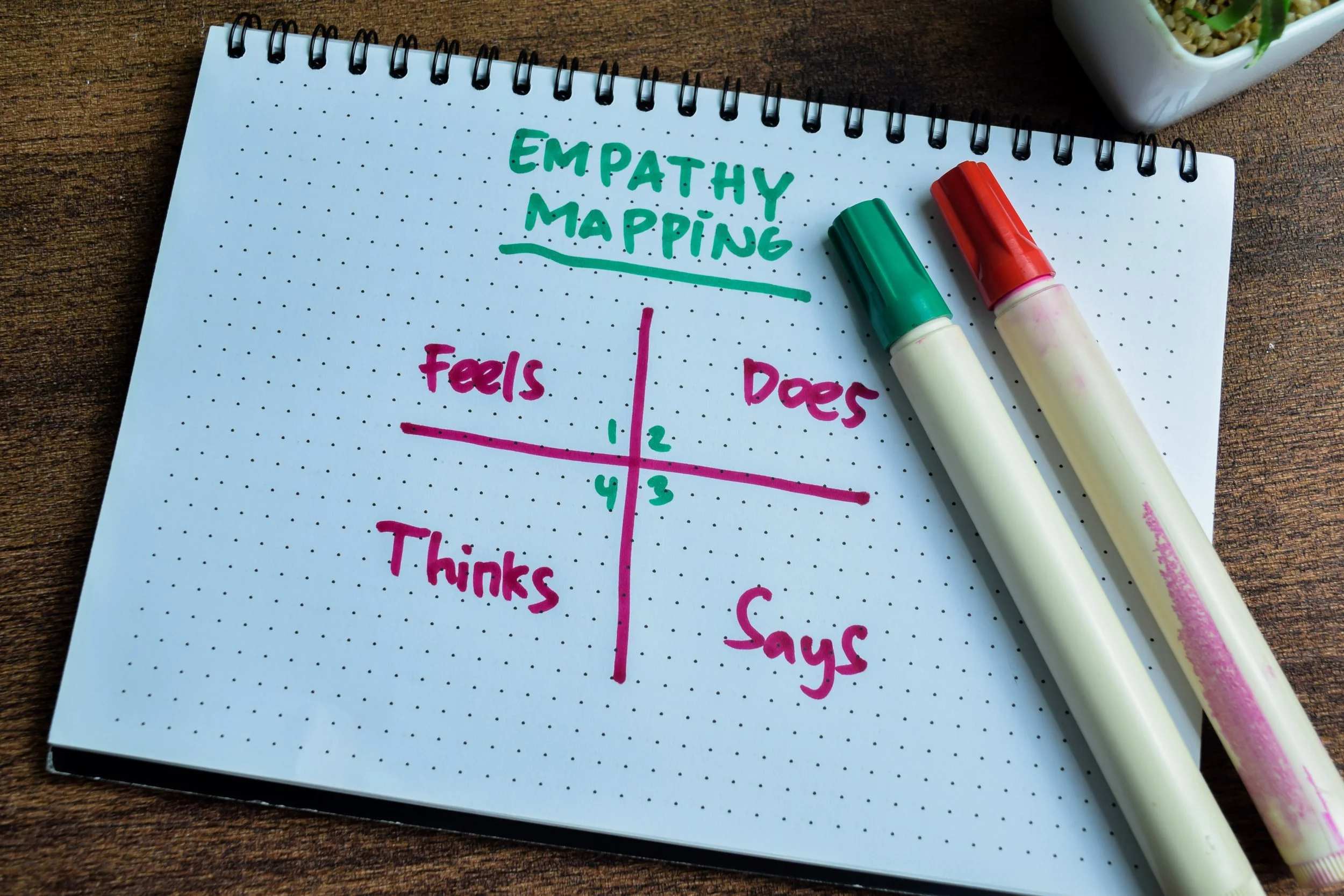
If you have never used it, begin with the four quadrants from Nielsen Norman Group: what your audience thinks, feels, says, and does. Here is their primer on empathy mapping, it is worth a careful read. When you really fill it out, you notice gaps in assumptions, tone, and even content hierarchy.
I have used empathy mapping to make decisions about typography and imagery. When you realize your audience feels overwhelmed, you do not reach for more decoration, you choose clearer type, simpler layouts, and language that reduces anxiety.
It is not a one time workshop, it is a lens. If your team is not sure who you are speaking to, draw the map and start from there. If you want help walking through the process, contact me.